When you first open a properly exposed Raw image, it usually looks flat and lacks punch. It’s nothing at all like you saw when you clicked the shutter. That image now requires processing in Photoshop’s Adobe Camera Raw (ACR), Lightroom, or the Raw converter of your choice. You can, and should, adjust the exposure, set the global white balance, capture sharpen, handle noise, etc., in ACR or its equivalent, but a discussion of Raw processing will be for future posts. For now, in general, just make sure you leave some room at the dark and light ends of the histogram, if possible, and leave the image a little flat to open in Photoshop. It’s always easier to add than to remove contrast and saturation in your final Master image.
So, what is the difference between contrast and saturation, and how do you add one, the other, or both?
Contrast is the difference between light and dark tones. You can also think of it as the separation between the shadows and highlights. An image with low contrast is said to look flat or dull, while high contrast makes an image look punchy or “contrasty”.
Saturation is the depth or intensity of the color. The lower the saturation, the less intense are the colors. They can look weak and pale. If you fully “desaturate” the colors, you end up with a monochrome, or black & white, image. On the other hand, if you increase saturation too high, the colors can become “oversaturated” and look unnatural.
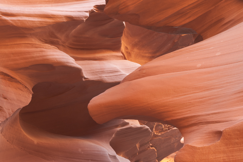
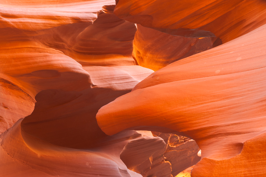
To illustrate the effects, let’s use an example from Antelope Canyon. As you may know, Antelope Canyon was created by erosion of the Navajo Sandstone. As sunlight streams in from the top, it both reflects and directly illuminates the intricate walls and surfaces in the narrow canyon. With your camera’s white balance set on Auto, the prevalent orange hue becomes sort of a grayish orange in the Raw image.
We’ll start with the unprocessed Raw image, shown below. As you can see, it’s rather flat and dull.
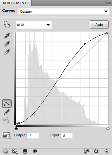
To add contrast and saturation, let’s add the following Curves adjustment layer:
By way of quick review, a default Curve is a straight diagonal line, from 0,0 at lower left to 255,255 at upper right. You can see this default line in the background of the Curves panel shown. If you increase the slope of the curve—in other words, make it steeper or more vertical—in Normal blend mode, you increase both contrast and saturation. That’s what was done above. Note: To make sure it would show up on your screen, I’ve made a much more severe adjustment in this Curve than I ever would in a single Curve in an actual image.
(If you aren’t clear on Curves, Blend modes, Layers, or other Photoshop functions, check out Charlie Cramer’s book in the Best Photoshop book post in Resources. If you don’t know what those functions even are, you might want to start by watching videos at Kelby Training, Adobe TV, Lynda.com, and the like. Then try those functions out yourself! They’ll soon be second nature.)
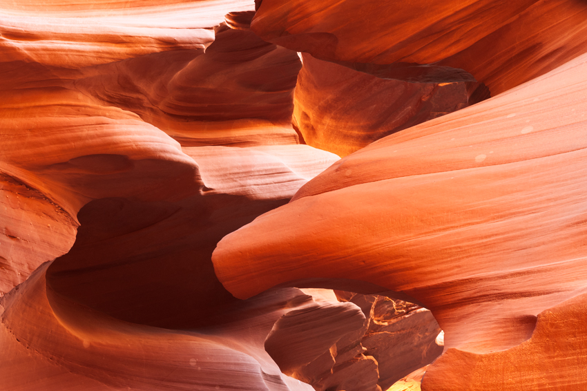
So here’s what the image looks like with that Curve applied:
It now has more separation between the darker and lighter tones than the original, and the orange colors are more intense.
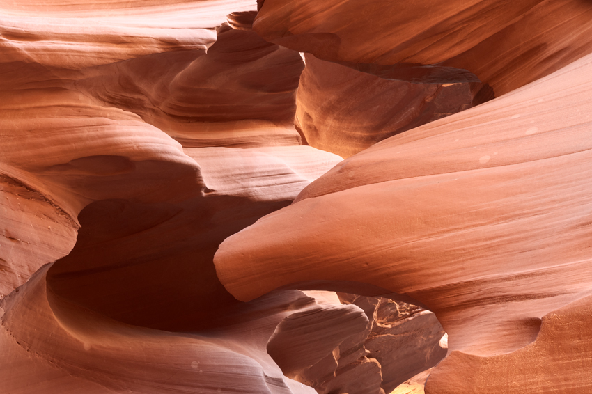
But what if you want only the contrast, but no additional saturation? Then you simply change the Blending mode of that Curves layer from Normal to Luminosity. Now, the Curve has only increased the separation between the darkest and lightest tones, but has not affected the depth or intensity of the color, like this:
The image has kept the better separation of tones, but has kept the original orange color.
If you want a more intense color, but without an increase in contrast, add a Hue/Saturation adjustment layer. Then slide the Saturation slider to the right. Here’s what the original image looks like with no Curve, but with the Saturation slider dragged to +40:
Now, the image has much more intense orange color, but has lost the crispness of the increased contrast, especially in the shadows.
Of course, none of these images are finished products. They have all been overdone to demonstrate the effects of adjusting saturation and contrast. Once you understand what they are, how they affect your image, and how to adjust them, you can decide how much contrast and saturation works best for each image.
As I’m sure you’ve surmised, there is a lot more to fully understanding contrast and saturation than could be posted in this introduction. My hope is that these posts will give you a better understanding of a topic, and spur you to experiment with it on your own.

Thank you I really need more of this for I like photography with all my heart I want to improve my pics and my creativity and thank you again I think I need more of such lessons for I have never done this before now my last question would be how will I know that my picture hall all the qualities and is the best one ever